
Saturday, June 4, 2011
Tuesday, April 26, 2011
Sunday, November 14, 2010
Foldable Kitchen Chair
People often take the daily objects they use for granted, such as the toothbrush they clean their teeth with, the utensils they eat with, and the chair they sit on. Most people do not necessarily analyze these objects in order to form an opinion on it; they simply like it, or dislike it. However, there are particular subconsciously judged elements that influence people’s experience with a particular object and its design; it is its ergonomics.


Photos take by Diane Wu
I never realized, before, how much work had been put into the designing of the folding chair I sit in everyday, as simple as it may be. I appreciated the convenience of the chair in its storage abilities, but always disliked the instability of the chair and its tendency to slip out from under the person if he sits too close to the edge of the chair. I am young, so falling out of the chair may not injure me severely. However, it may be a potential hazard for my grandparents who are in their late eighties; they cannot afford the fall. As a result, the design of the chair does not meet the safety requirements for people of all age groups, thus, limiting their potential group of buyers.
Although my height and leg length fit the chair rather well, the chair lacks support for the lower back. People with back problems or who tend to sit for a long time will not find comfort in this chair. The edge of the seat also has corners that often scrape against my legs and leave a red line mark after sitting for a period of time. According to comfort, these chairs are not made for sitting for a long time. They are simply used for temporary convenience such as eating in the kitchen.
These folding chairs are very light and easy to fold and store away in cabinets. They are portable and slide smoothly into their positions. The wood has a smooth finish, therefore, it a good kitchen chair because it is waterproof and easy to wipe clean with a towel when there’s a spillage. It functions very well if used correctly, for example sitting completely on the seat rather than the edge, so its performance is acceptable.
The simple design of the folding chair gives it a minimalist feel. The light color of the wood finish decreases its visual weight, making it appear even lighter than it already is. It has formal balance meaning that the chair is symmetrical on both sides, which creates harmony and unity to the overall look of the chair. The proportion and form of the chair fits comfortably with the human bodily proportions, thus, meeting the function of the object as a chair.
Although not the most comfortable chair in the house, the foldable kitchen chair meets the functional requirements. Its safety is acceptable for younger people who can quickly recover from a fall. It is lightweight and easy to store away. It is also aesthetically pleasing. Therefore, its ergonomics is acceptable, but there are improvements that could be made, thus, designers must not forget the design process of doing and redoing.
McDonald's Logo

http://saleshq.monster.com/nfs/saleshq/attachment_images/0003/0943/mcdonal_max200w.jpg?1232051378
Designing logos for companies and industries is a very important and painstaking process that incorporates slight adjustments and constant changes. McDonald’s, one of the biggest fast food industries has the famous globalized “m” sign. This graphically-designed logo originally came from the architectural construction of McDonald’s buildings that included two golden arches at the entrance. Now, this logo replaced the architectural construction, but is still recognizable to anyone at first glance.
The addictive quality of McDonald’s food is not the only role that played behind the success of this logo. The artistic design of the two golden arches is highly influential in attracting guests to eat at the restaurant through the use of yellow and red colors because they are the most vibrant and eye-catching colors easily be spotted from a distance. Red and yellow mentally increases a person’s appetite and heart rate so that they will eat more and eat faster in order to leave quickly and open up more space for the next costumers. The logo’s form has a formal balance, meaning that it is symmetrical on both sides when cut by a vertical axis straight down the middle, giving the logo harmony and unity. The flowing design of the “m” creates a sense of movement that leads the viewer’s eyes from the left to the right side of the logo’s shape. McDonald’s also sometimes uses orange along with the yellow and red in their logo design, making their color theme analogous, which is very pleasing to the eye. McDonald’s also uses the artistic element of scale to attract attention. For example, the McDonald’s in Wal-Mart has two large golden arches as its entrance, which draws a lot of attention, inviting people to enter the restaurant and buy food.
Monday, November 8, 2010
Street Art: Edgar Mueller
Art is not only found in Museums and showrooms. It can be found anywhere, even on streets we walk through every day from home to work. Edgar Mueller is a street artist who creates anamorphic images, which are carefully constructed distortions that can be viewable only from one spot. Therefore, in his work, perception is very important because it is able to bring his 2-dimensional drawings on the ground into 3-dimensional images.

It doesn’t matter whether passersby are armed with artistic knowledge of the principles of design or not, we can all agree that Edgar Mueller’s anamorphic images are simply amazing.
Here is a Youtube video showing the process of his artwork:
http://www.youtube.com/watch?v=3SNYtd0Ayt0
souces:
http://www.metanamorph.com/albums/userpics/10001/normal_i-can-fly.jpg
http://www.metanamorph.com/displayimage-album,4,pos,0,3D%20Pavement%20Art-Ice%20Age-The%20Crevasse.html
http://www.metanamorph.com/albums/userpics/10001/normal_i-can-fly.jpg
Mueller worked with 250 square meter of open pavement when he created The Crevasse. In his painting, he used blue as the monochromatic color that brings visual unity to his painting. The Crevasse uses one-point perspective through the incorporation of repetition with lines that leads “downwards,” or closer to us, towards a single vanishing point. The repetitive use of lines create a visual rhythm, bringing harmony to the overall painting. Mueller also created lighting by painting the “top” of the crevasses lighter, and then gradually darkens the blue color as it reaches closer to the “bottom” of the crevasses, mimicking the effects the sun would have on an actual 3-dimensional crevasse. The area closest to the vanishing point is painted black, and thus, encourages the viewers to use their own imagination in creating the illusion of depth. The asymmetrically balanced or informally balanced painting, which has a well-distributed visual weight, brings equilibrium to the overall effect of his work. It doesn’t matter whether passersby are armed with artistic knowledge of the principles of design or not, we can all agree that Edgar Mueller’s anamorphic images are simply amazing.
Here is a Youtube video showing the process of his artwork:
http://www.youtube.com/watch?v=3SNYtd0Ayt0
souces:
http://www.metanamorph.com/albums/userpics/10001/normal_i-can-fly.jpg
http://www.metanamorph.com/displayimage-album,4,pos,0,3D%20Pavement%20Art-Ice%20Age-The%20Crevasse.html
Inspirational Posters: How Word and Image Work Together
The general format and design of these posters were originally created to inspire people, hence the name “Inspirational” Posters. These posters are created by juxtaposing a motivational word under an amazing photograph taken from basically anywhere in the world. The principles of arts incorporated into the photograph are methods that further strengthen the message of the poster.
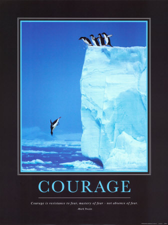
In this photograph, the juxtaposition of the image and word conveys a feeling of kinesthetic empathy that draws an emotional response from the audience. Seeing these cute little penguins in nature fearlessly dive head-first into the ice water inspires human to feel that if such animals can have enough courage to leap so far down, we can do it too. The poster quotes Mark Twain, “Courage is resistance to fear, mater of fear- not absence of fear” which supports the image and is used to strengthen and give a more direct message to the reader. This photograph is remarkably taken due to its monochromatic background of blue. The vertical positioning of the photograph creates a feeling of strength and power that can further motivate people to take a leap of faith in whatever they are trying to achieve. The left-most penguin on the ledge that is about to dive into the water exemplifies the use of psychic line. The positioning of his downward-angled head guides viewer’s eyes towards the single penguin, the focal point emphasized by isolation, that is about to hit the water. The visual balance of this photograph is also striking because even though the huge block of iceberg is shifting the visual weight to the right, the leftward movement of the penguins drives the image to equilibrium. Overall, the success of these inspirational posters is mainly due to its use of both images and words to convey an idea and emotion.

Many people, as a result, imitated the format for these posters, and instead of motivating people, used it to draw a more humorous response.
Mom's Cancer
On November 2, 2010, author Brian Fies visited our Design 001 class to talk about his comic-style book Mom’s Cancer. Fies explains that he wrote his book about his mother’s cancer in a comic-style because he wants make this hard and personal experience more relatable to other people whether they’ve experienced the struggles of fighting cancer or not. Comic is basically a mixture between art and literature. The words are equally as important as the images drawn, making them interdependent.


On page 10 of Fies’ book Mom’s Cancer, he depicts his mom’s experience of literally “drowning” in words when people try to explain to her the facts and process of cancer treatment. In this case, rather than seeing words and images, the words have basically become the background image for this particular strip. The form of the words and the images makes full use of the kinesthetic empathy, evoking our sense of emotion, to communicate to the audience a sense of being overwhelmed. The reader can try reading the background words, but the words do not form complete coherent sentences, thus further contributing to the content and idea of confusion. Fies allows his mother to become the center focal point of this slide simply by surrounding her with the mass jumble of words, making her the only “picture” used. Even though this slide creates mental disorientation, the repetition of the background words creates an allover pattern, a technique called crystallographic balance, and a sense of rhythm that brings harmony and visual unity to the overall context. Fies also uses only black and white hues in his comic on most of his pages to ensure that the audience focuses more on the content of the book rather than simply the aesthetics. There is also movement in the way Fies drew his mother; as a reader, we can imagine her drowning, and struggling to stay afloat.
Sources:
Fies, Brian. Mom's Cancer
Subscribe to:
Comments (Atom)